Tuesday, 26 November 2013

The Other Jocks!


When it came to drawing the main jocks friends in this scene i wanted to keep the continuity of the stereotypes the same. To do this i have kept the main features the same such as the colour, wing positions, expressions and the abs the same. The reason i have done this is because if i drew them all differently then the audience wouldn't think they belonged to the same social group and it would look strange. 

The difference between these characters and the main character is the fact that these guy firstly don't look as good but also the size difference of the characters. You cant tell right now as they are just pictures but these characters are actually going to be around half the size as the main character to amplify his power to the audience. Another thing that is different it between the main jock and these jocks is the fact that they don't look as big. I have still chosen shapes that still get the message across that they are big, by making the shapes wider. This look gives them the impression that they are very muscly but not very ripped. They are also missing the peck lines unlike the main jock just to show that he is bigger once again.  

The Main Jock Character!


When i was coming up with the idea for this character, the reader profile that i created for jocks really helped me out. This was because very stereotype of a jock i could see right in front of me, therefore i could put all these aspects of that into the creation of the character. The main feature that i made sure this character had were things such as he had to look big and muscly because jocks stereotypical play sport and goes to the gym. 

In this character i fell as if i have really captured his strength and anger. I think the use of the upside down triangle as worked really well as it give the character the impression of been strong. Another thing that i have added in to reinforce that the character is meant to be strong is by giving him some pecks and abs. These are all stereotypical feature of a jock. The hair that i have give him is meant to represent as mohorch as these are associated as tough guy hair cuts. Another key feature of the character that makes him look stronger and tougher then the rest is the size of his wing span. I have purposely made it much larger then all the other character and when it comes to sizing the character he will be much bigger then all of the to show his power over the rest. 


Jock Scene Background!


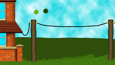
The third background in my short animated film is the scene for the jocks. I decided to base this scene with a house in it because i wanted it to represent a frat house you would find in America. The other key features that i decided to add into the scene was a football field, or the football post and score board to represent the the football field, and the telegraph poles as that's where the animation will be taking place on. 

When i first started to create the image on Photoshop i didn't realizes how complex drawing a house was going to be. For example, all the bricks on the house were individually drawn and shaded to give it a realistic look. I then had to place them in appropriate positions and shade them were needed to make it look like its meant to be more stuck out then the rest. After i had done that and drawn all the key feature of the house i then realized that the frame positioning was all wrong and the house on my drawing took to much of the frame up and it looked wrong. Therefore i decided to enlarge the house and place it further off the frame. This seemed to work and it made the framing of the stage a lot more even and better then it did on my drawings. 

After that i then added in the telegraph poles. These are the same telegraph poles as the ones in the opening scene as it didn't seem worth wasting more time redrawing them when there are only in one scene for 30 seconds. But if i do get some spare time i may go back and re-drawn them anyway.

Like in all of my scenes so far there is some sort of fence in the background filling up the background space to make the scenes more exciting. For this scene i wanted to uses a hedge as i thought that this would be an easy thing to create and look visually good. But i was very wrong. Creating this hedge was very hard to do as i couldn't get the correct texture of the hedge and it just looked like a a solid mess. After playing around with the settings on Photoshop and lots of trial and errors i finally came to a hedge that i was happy with and decided to keep it  


Monday, 25 November 2013

Stereotypes Of Jocks Reader Profile!


After seeing how effective these reader profiles were in As-Level i have decided to produce them for my stereotypes of all my character stereotypes. This is because when it comes to drawing/ animating the scene i want to be able to see all the this associated with jocks in one place so i can get a feel of how they look, act and move. 

I have found this very helpful when it came to drawing the backgrounds and the characters for the jock scene. This is because i can read through what and how the jocks should be like and see visually what they  are like and look like and get an image in my head that i can transfer into my drawings to create the scenes, characters and the animation.   

Monday, 18 November 2013

Second Scene Ready For After Effects!!


This is the first complete version of my second scene for Bernard. As you can see it is very pixalated as the full resolution version file size was to big to be able to upload. Another thing you may have noticed is the lack if editing/ no editing. This is because the Adobe Flash, the software i am using to created the animation only an animating software and is editing software. This means that i am creating the movements and positing of Bernard on Flash and i will then copy all the open layers and reconstruct it on Adobe After Effects to incorporate the editing.

As this is the first draft of the second scene i can see my self changing it as i get more and more feedback from my peers. Depending on the reacting and comments i may see some big changes or little changes to this scene. However i am confident to say that when the editing is finished on this scene i feel like people will like it a lot more as the main focus on this scene is Bernard's emotions which you cant really see in this because of the low quality.     


Second Background Path of Bernard Mostly Completed and Started Face Expressions!

Different types of Animations!

Sunday, 17 November 2013

Second Background Staring to Animate!

After drawing the background, i then got straight in to animating the second scene. What you can see is just the first ideas for the movements that Bernard will do in this scene. What you  can see now i will end up changing most of the movement already. You cant see it because it is so zoomed out but there is a foot in the nest actually kicking Bernard out which will be zoomed in on in the editing. In this short clip, the one part that i am most unhappy with is the washing line movements as they look really artificial and not very realistic at all. This is something i will improve as a move things around until it looks realistic. 

Saturday, 16 November 2013

Drawing the tree for the Second Background!


Second Background!


When it came to drawing this background, i want to capture a normal home environment. However i didn't just want an ordinary bricked house and the setting for my short film is in the middle of know where so you'd be more likely to find a wooden house with a porch. This really makes it obvious that its meant to be a house. I then wanted Bernard to be kicked out of his nest so i had to link the tree into the scene somehow so what i did was put a tree in the background and linked that to the house by a washing line. 
As you can see the hand drawing has a hedge in the background and the digital version has a fence instead. This is because when i tried to make the hedge, i couldn't find a technique that maker it look like a hedge and not just a mess. So i decided to change it to a garden fence and it stand out more as the edge of the garden. 

Monday, 4 November 2013

Editing With Adobe After Effects!!


This project is going to use a lot of different software to create the final out come. This is a print screen of Adobe After Effects. What i have already done here is, i have created a background in Photoshop as a background, then i created the animation movements in Adobe Flash and no i have combined them both in Adobe After Effects. I have also added things like gaussian blur to add a scene of depth the the background. Its taken me a while to get the hang of the software but now that i have warmed up to it now its becoming a lot easier to use and create better outcomes.